How to create Gutenberg Blocks, the easy way


Create a custom block for Gutenberg is actually a lot easier than expected
What is Gutenberg?
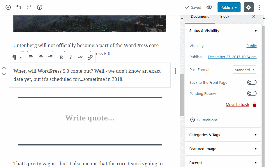
Gutenberg is the new editor for WordPress, which is gonna replace the old-fashioned TinyMCE. At the time of this writing, Gutenberg is not considered mature enough for production, but it will be soon (it is planned to be fully merged into WordPress 5.0 in late 2018); it is available as a plugin, in order for blog authors and developers to get familiar with it – and give feedback.
The main concept
Gutenberg is trying to overcome the traditional authoring phase giving the author the opportunity to insert rich content – not just plain text, but images, galleries, videos, quotes, social media content and many many more – introducing the concept of “blocks”.
So what is a block? Basically, it is a unit of (whatever) content which can be edited, organised into (surprisingly) a block. Gutenberg comes with a predefined set of blocks, ranging from simple text editing (headings, paragraphs, list, etc.) to multimedia content (image, gallery, audio, video) to embedded content from multiple sources (especially social media); so, at the time of writing, the default toolkit is quite rich and appealing.
But what if I want to make a new one? Here is the good news: you can!
Developing a block: the basics
Gutenberg’s blocks are made almost entirely in JavaScript, so all you need to know is the standard version of the language (ES5). According to the folks who developed it, the API is not tied to any framework – just old plain JavaScript.
However, the way a Gutenberg block works is really similar to a React component and understanding ES6 (modern JavaScript) and JSX (the new JavaScript syntax introduced by React) will uncover all its potential. Even if it is not necessary, it is highly recommended to:
- use a modern (ES6) JavaScript syntax, as well as JSX
- have an at least basic understanding of React
Sounds really complicated…
Well, not really…Luckily, there is an app called create-guten-block, available as a npm package, which is gonna do all the heavy lifting for us. The app creates all the scaffolding, that is: the files and the configurations necessary for the block to run, letting us focus only on the functionality. It comes as well with a listener, so whatever changes we make is immediately translated into the build files. Pretty handy!
At the same time, we can use a whole bunch of predefined objects (mainly editor components) which come by default with the Block API, so that we don’t have to write that much code in order to get a pretty nice interface.
Anatomy of a Gutenberg block
Once create-guten-block has finished its job, we can observe all the new files and folders created for us in the main folder. Let’s dive a bit into it. The files we are going to edit to develop the block are located in the src folder. These files will be automatically trans-piled into production code, which is located into the dist folder.
So actually what matters is into src, which is made of:
- init.php, the file in which the plugin is actually registered. Since the app did already the job for us, we can leave it as it is
- the block folder, where all the important stuff is. We are going to take care of all of them!
The editor.scss file is the look and feel of how the block will be in the back end. Unsurprisingly, style.scss is its counterpart on the front end, that is: the web page. They are both SASS file and they are going to be translated into regular CSS files.
The block.js is where all the functionality resides and it is, therefore, the most important one. All the magic is done inside the create-guten-block’s registerBlockType method, which is responsible for creating the block itself. It takes four parameters:
- a unique name for the block;
- an initialisation object, containing some configuration info and the special attributes object;
- the edit function;
- the save function.
The edit and save functions control the behaviour of the block, respectively, in the back and in the front end. The default installation of the app shows a simple hard-coded message with a different text (and background colour) depending on the side (back or front, or, put in other terms, edit or save function). These are the two pieces of code we are going to work on the most.
A special mention for the attributes object. This object is the way we deal with dynamic data in the block and is pretty much the same to what React calls a “state”. So, if the data in the block are likely to change (and they probably will), for example, a field which can be edited by a rich text editor, we have to save them in the attributes (and then they are going to be saved in the database).
Let’s dive into code
We are going to create a very simple block with the following elements:
- a second level title (h2)
- an image
- a sideline
- a ‘Read more’ link
The first step is to run the create-guten-block app and open the block.js file inside src/block.
Note: It is recommended to edit the name of the block, which is now ‘cgb/block-myblock’; remember that the name must contain a prefix (everything coming before the slash).
Importing all the utilities we need
In our simple block, we are going to use a basic editor (where we are going to type the title and the sideline text), an image upload component and a basic text field for the anchor URL. Instead of developing all these components, we can just use the ones WordPress gives us, thus speeding up the development phase. All we have to do is to import them at the very beginning of our file:
import './style.scss';
import './editor.scss';

const {__} = wp.i18n;

const {registerBlockType} = wp.blocks;

const {RichText,MediaUpload,InspectorControls} = wp.editor;

const {PanelBody, PanelRow, Button } = wp.components;
The RichText component is a basic editor with a few controls; we are going to use it for the title and the sideline. The InspectorControls represents the configuration sidebar on the right: we are going to put the text field for the anchor URL in here. PanelBody and PanelRow are the sub-components of the InspectorControls. Finally, MediaUpload is the component for the upload of the image; we are going to take advantage of the predefined Button element for the purpose.
The init object
The second parameter of the registerBlockType method is an initialisation object where you can specify lots of useful informations; what matters the most is the attributes object. According to the result we are trying to achieve, we need to store the following informations:
- the title content
- the image source file
- the media ID (related to core WordPress functionality)
- the sideline content
- the link URL
Each piece of information needs to be coded in a different way, depending on its role; its core attributes are:
- type
- source
- selector
The type can be a simple string or an array. For example, the sideline text will be an array because inside it we can have nested elements (text in bold will be translated into a strong tag, text in italic into an i tag; this is due to the editor we are going to use, which gives us this kind of control over text). For the same reason, its ‘source’ (that is: content) will be the whole set of its children (pure content plus markup – strong and i tags as stated before).
Different story for the image source file: it is a simple string, which source is an attribute (so we need the ‘attribute’ property with ‘src’ as a value).
The selector property will match the HTML element in the edit function, so that we can tell the system which element content is the attribute’s content. It can be any valid CSS selector.
Our init object should look like this:
{
   title : __('Image with text'), // Block title.
   description : 'A simple block',
   icon: 'format-image', // Block icon from Dashicons → https://developer.wordpress.org/resource/dashicons/.
   category : 'common', // Block category — Group blocks together based on common traits E.g. common, formatting, layout widgets, embed.
   keywords : [
      __(image), __(text)
   ],

   attributes: {

      title: {

         type: 'array',

         source: 'children',

         selector: 'h2'
      },

      mediaID: {

         type: 'number'
      },

      mediaURL: {

         type: 'string',

         source: 'attribute',

         selector: 'img',

         attribute: 'src',

         sideline: {

            type: 'array',

            source: 'children',

            selector: 'p'
         },

         linkURL: {
            type: 'string',
            default: 'http://example.com'
         }
      }
   }

}
The edit function
The edit function represents the interface on the back end, so what we are going to see once we add the block on the page. It takes an object as parameter (conventionally called ‘props’) inside which we can find all the information available in the ‘state’ (the ‘attributes’ object).
So, the first step is to get all the information we need:
const {attributes: {title,mediaID,mediaURL,sideline,linkURL }, setAttributes} = props;
Inside the return statement goes the actual code which will be rendered:
return (<div className={props.className}>

  <InspectorControls>

      <PanelBody title={__('Link URL')}>

         <PanelRow>

            <label>Link URL</label>
            <input type='text' value={linkURL} onChange={onChangeURL}>

      </PanelRow>

      </PanelBody>

   </InspectorControls>

   <RichText tagName='h2' placeholder={__('Title')} value={title} onChange={onChangeTitle}/>

      <div className='block-image'>

         <MediaUpload onSelect={onSelectImage} type='image' value={mediaID} render={({open}) => (<Button className={mediaID
                  ? 'image-button'
                  : 'button button-large'} onClick={open}>

               {
                  !mediaID
                     ? __('Upload Image')
                     : <img src={mediaURL} alt={__('Upload Image')}/>
               }
            </Button>)}/>

      </div>

      <RichText tagName='p' placeholder={__('Sideline’ )} value={sideline} onChange={onChangeSideline}/>

   </div>);
The first thing to observe is how the state of the block, that is: what is contained inside the attributes object, is the source of content for all the elements. This approach is the same as the state as the single source of the truth in React applications; basically, it means that the elements’ content is always the corresponding property of the attributes object and, as soon as we change it (that is: editing content in the editors or choosing a different image), we have to update the attributes object as well. This is done through the onChange property of each element, inside which we specify the function taking care of it. For example:
function onChangeSideline(newValue) {

 setAttributes({sideline: newValue});

}
Where setAttributes is the core Gutenberg function to update the state. Since all this functionality is used just inside the edit function, it makes sense to define them in the same scope as well.
The save function
Where (finally) we can render the block on the front end. This function takes the same object as the edit’s one as a parameter, so we have all the informations we edited in the back end:
save: ( props ) => {
      const {
         className,
         attributes: {
            title,
            mediaURL,
            sideline,

         },
      } = props;
      return (
         <div className={ className }>
            <RichText.Content tagName="h2" value={ title } />

            {
               mediaURL && (
                  <img src={ mediaURL } alt={ __( {title} ) } />
               )
            }

            <RichText.Content tagName="p" value={ sideline } />

         </div>
      );
   },
Nothing special to notice, apart from the fact that we are getting the editors’ contents through the RichText.Content property.
Next steps
We can take care of the styles, both in the back and in the front, editing the corresponding SASS files.
Final considerations
That’s it, pretty much! Even if pretty basic, this example gives the idea of what you can do with this powerful API. Gutenberg is the future of WordPress, so better start to get familiar with it and to develop some nice blocks!